

Data Insight Summary:
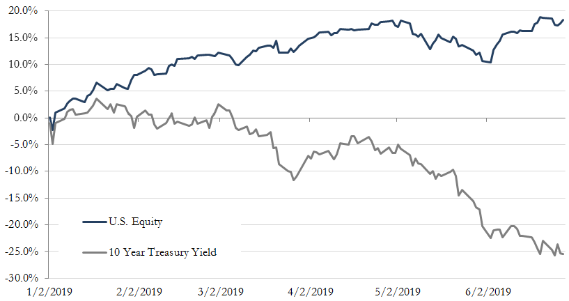
Year to date performance of U.S. Stocks (“Stocks”) and U.S. Treasury (“Bond”) Yields have experienced a significant divergence with stocks increasing as Treasury Yields have declined.
Through the first half of the year, U.S. Stocks have rallied 18.3% while rates, measured by the 10 Year U.S Treasury yield have declined 26%.
In addition, the yield curve of U.S. Treasuries has shifted down across all maturities and inversion of the yield curve has deepened as the 2, 3, and 5-year maturities are yielding less than 6-month and 1-year maturities.
We take a look at the divergence in performance, its causes and implications it may have on the two asset classes going forward. We explore this divergence in relation to the movement and the shape of the yield curve.
Figure 1: Year to Date Performance of U.S. Stocks and Treasuries
Differing Stock and Bond Market Positioning:
January was met with the Federal Reserve (the “Fed”) reversing their previous hawkish stance as it relates to interest rate policy, signaling a more accommodative attitude. As such, the markets have now assumed the probabilities of rate cuts of 25bps and 50bps at the end of July to be 82% and 18%, respectively. This is a significant change in expectations from the start of the year when the probability of a rate cut was only 3.5%. Clearly, the Fed is digesting some pretty concerning macroeconomic information.
As the probability increased for an ease in monetary policy, equities have rebounded off December lows and notched new highs. On a valuation basis, using a price-to-earnings (P/E) measure, the new equity highs have been achieved primarily through P/E multiple expansion, as opposed to an increase in company earnings. Equities appear to be hopeful that the Fed’s actions will help sidestep the slowdown occurring in the global economy and potentially avoid a recessionary event in the next two years – leading us back to the goldilocks scenario U.S. investors have enjoyed over the past few years.
On the other hand, Treasury Yields both short-term and long-term have declined significantly during this period, as investors have continued to allocate to safer haven assets as economic fundamentals have continued to deteriorate. From a capital flow perspective, the current divergence is signaling concern from the Bond market on the Fed’s ability to manage the slowing economic backdrop. We can note in the snapshot detailed in Figure 2 that the overall yield curve has fallen, flattened, and become inverted across nearly all maturities. Furthermore, the yield curve inversion is occurring as market participants exhibit concern over growth prospects in the near-term. More specifically, as more uncertainty stems from softer economic data, investors tend to flock to longer-dated Treasuries to lock in risk-free yields and position themselves to profit if rates continue lower (as yields go down, bond prices go up) – as typically occurs before and during economic recessions.
Figure 2: Change in U.S. Treasury Yield Curve (Jan-Jun 2019)
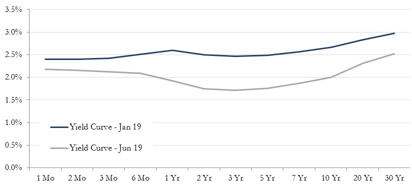
Source: RQA & U.S. Treasury.
Who Wins the Battle – Goldilocks or Not-so-Goldilocks:
While Stocks are still pricing in a goldilocks scenario, the outlook from the Bond market suggests the road may be a bit bumpier. In the goldilocks scenario, the Fed will remain ahead of the slowdown and provide liquidity as needed, re-establishing the longer-term economic expansion, while hopefully keeping inflation levels subdued and modest (i.e. keep the economy “just right – not too hot, not too cold”).
The not-so-goldilocks scenario is a continued flight to safety as we’ve witnessed within the bond market more recently, specifically in the 2-10 year maturities, as near-term growth is slowing more quickly than the stock market is currently accounting for. In this scenario, we should likely expect P/E multiple contraction to take place in risky asset classes, causing declines in Stocks and additional flight to Treasuries and other safe-haven assets.
Concluding Thoughts:
While no one has the crystal ball to determine who wins the battle and what scenario will unfold, we think its likely Stock and Treasury Yields will eventually revert again to their historical positive correlation. As it relates to what these scenarios mean for asset allocation, the best approach, as always, is to have a plan and act accordingly. Specifically, it is likely a good time to access exposure to risk-oriented assets and rebalance where necessary.
At RQA, we let the data guide our asset allocation decisions and adjust accordingly with a constant focus on risk management. As we move forward, goldilocks scenario or not, applying a systematic rules-based approach to investing allows us to remain objective about the markets and alleviate any psychological pitfalls that many succumb to in more difficult market environments. We maintain our view that the best path any investor can take – particularly in today’s environment - is to continually seek out maximum portfolio diversification and rigorous risk management in order to optimize the balance between portfolio growth and protection throughout market cycles.
To receive RQA Research and Updates, sign up with your email.
Disclaimer: These materials have been prepared solely for informational purposes and do not constitute a recommendation to make or dispose of any investment or engage in any particular investment strategy. These materials include general information and have not been tailored for any specific recipient or recipients. Information or data shown or used in these materials were obtained from sources believed to be reliable, but accuracy is not guaranteed. Furthermore, past results are not necessarily indicative of future results. The analyses presented are based on simulated or hypothetical performance that has certain inherent limitations. Simulated or hypothetical trading programs in general are also subject to the fact that they are designed with the benefit of hindsight.